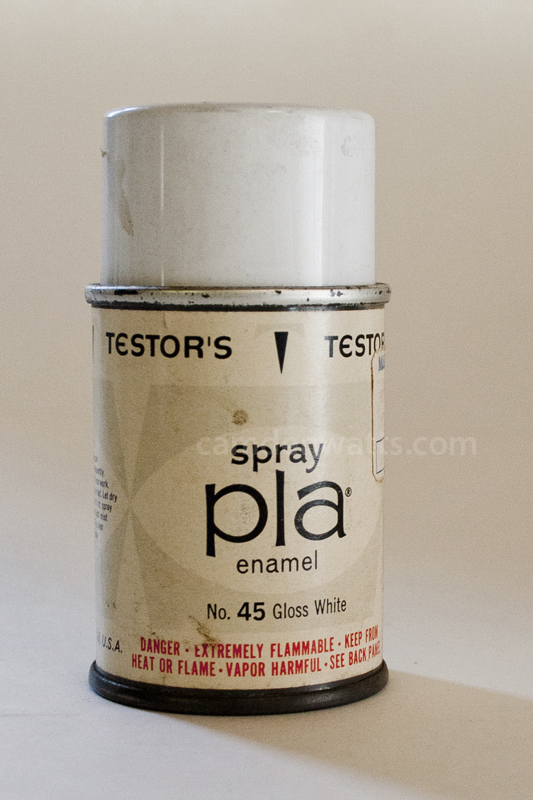
Here’s a dose of package design inspiration for my fellow creatives. This can of spray enamel was found at my grandparents. My dad lovingly laughed at me for hanging on to it, but this was just too cool to throw out.
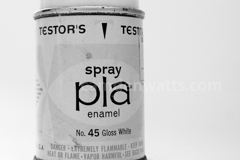
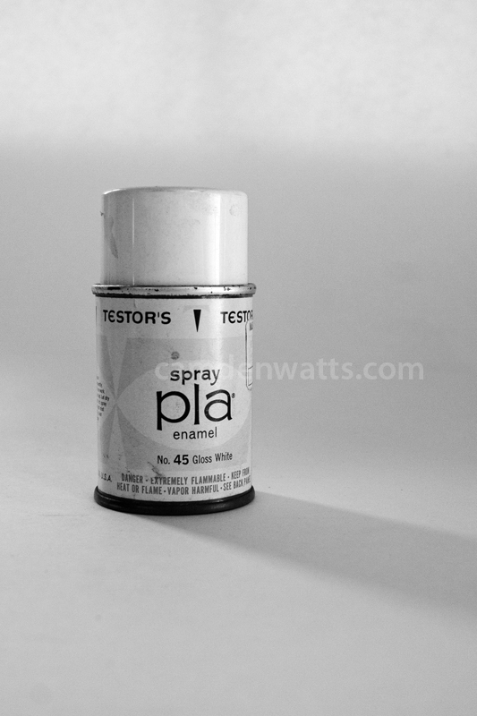
The package designer opted for sans-serif typefaces across the board, making for a clean, easy-to-read package. The entire label is two-toned, except for the red warning label at the bottom. A horizontal graphic across the middle unites the piece without being overpowering.
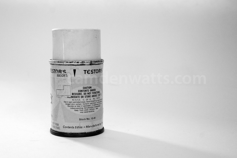
The can is so perfectly aged: scuff marks, dirt, and rust cover it. The first photo is in color so you can see the yellowed label and red warning at the bottom. I like a little more contrast in my photos, so the black and white pics are my favorite.
Photographing this old can might seem weird to some people, but it made me happy. The historian / anthropologist in me comes out every now and then. It was a fun way to practice some photography skills, too. It could inspire a fun flashback scene in a film or a new print design, you know? I hope you find some inspiration here! Enjoy!


